SALDIVAR BRAND DESIGN
CREATIVE STUDIO
Selected work shaped through strategy, identity and digital experience.
© 2026
ALL RIGHTS RESERVED
2014 — 2026
CDMX / MEXICO
PROJECT / 05 / 2015 / CDMX
LAND
NIGHT CLUB
A nightlife brand built for those who refuse to blend in.
CASE OF STUDY
ROLE
BRAND STRATEGY
NAMING
VISUAL IDENTITY
DIGITAL EXPERIENCE
SOCIAL MEDIA
FOCUS
STRATEGY
IDENTITY
EXPERIENCE
CULTURE
RADICAL SELF-EXPRESSION.
RESEARCH
PROBLEM
Nightlife brands often rely on familiar visual codes, making venues feel interchangeable. LAND needed to establish distinction.
OPPORTUNITY
Create a brand where self-expression becomes the experience turning unconventionality into a shared visual and cultural language.


00. BRANDING STRATEGY
A TERRITORY FOR THE UNCONVENTIONAL
LAND CLUB was conceived as more than a nightlife venue. The branding strategy positioned LAND as a distinct territory within Mexico City’s nightlife scene a place where conventional rules could be suspended and radical self-expression became the foundation of the experience.
The name evokes a sense of place beyond traditional boundaries, creating a narrative around freedom, originality, belonging and otherworldly experiences.
KEY IDEA
LAND AS A STATE OF EXPRESSION.
01. NAMING & VISUAL IDENTITY
FUNCTIONAL REBELLION
The identity translates LAND’s unconventional positioning into a visual system built around functional rebellion.
The custom logotype challenges conventional typography: the A becomes an upward-pointing arrow, symbolizing elevation beyond the ordinary, while the D transforms into a rotated smiley face a coded expression of euphoria and belonging.
The symbols are not added to the identity; they become part of the name itself.
02. ART DIRECTION
A SURREAL LANGUAGE FOR THE NIGHT
The identity expands into an experimental visual world shaped by surreal imagery, unconventional compositions and unexpected associations. Dark environments, dramatic lighting, altered perspectives and surreal scenarios create a universe that feels both familiar and otherworldly. The result is a visual attitude that remains dark, expressive, irreverent and unapologetically unconventional.
03. BRAND ECOSYSTEM
FROM IDENTITY TO EXPERIENCE
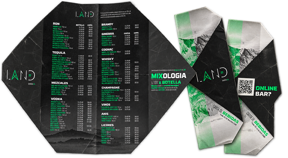
The LAND identity was designed to live beyond the logo, extending across digital, social and physical touchpoints. The ecosystem included digital experiences, social media, posters, merchandise, stationery and environmental applications, allowing the visual language to move naturally between communication, space and culture. Every touchpoint reinforces the same idea: LAND is not simply a place to go it is a territory to enter.
BRAND STRATEGY
VISUAL IDENTITY
DIGITAL EXPERIENCES
PRODUCT DESIGN
MOTION & CONTENT
INTELIGENT SYSTEMS
Designing stories since 2014
© 2026 SALDIVAR BRAND DESIGN
ALL RIGHTS RESERVED · CDMX, MEXICO