SALDIVAR BRAND DESIGN
CREATIVE STUDIO
Selected work shaped through strategy, identity and digital experience.
© 2026
ALL RIGHTS RESERVED
2014 — 2026
CDMX / MEXICO
PROJECT / 11 / 2025 / CDMX
FLOW33
COFFEE / ART / LIFESTYLE
A LIFESTYLE BRAND BUILT AROUND MUSIC, COFFEE, ART, AND CREATIVE FLOW.
CASE OF STUDY
ROLE
BRAND STRATEGY
NAMING
VISUAL IDENTITY
CHARACTER DESIGN
BRAND COLLATERAL
SOCIAL MEDIA
FOCUS
STRATEGY
IDENTITY
CHARACTER
EXPERIENCE
CULTURE
creative flow.
RESEARCH
PROBLEM
COFFEE CULTURE OFTEN RELIES ON FAMILIAR VISUAL CODES, MAKING BRANDS FEEL SIMILAR AND EASY TO FORGET. FLOW33 NEEDED TO BUILD A MORE DISTINCTIVE IDENTITY THAT COULD CONNECT COFFEE WITH MUSIC, ART, AND A CREATIVE LIFESTYLE.
OPPORTUNITY
CREATE A BRAND WHERE COFFEE BECOMES PART OF A LARGER CULTURAL EXPERIENCE ONE BUILT AROUND MUSIC, ART, NOSTALGIA, AND CREATIVE EXPRESSION. A DISTINCTIVE CHARACTER COULD GIVE THAT EXPERIENCE A MEMORABLE AND HUMAN FACE.

00. BRANDING STRATEGY
The strategy for FLOW33 was built around the idea of creative flow a space where coffee, music, art, and everyday life naturally come together. Rather than positioning the brand as a conventional coffee shop, the concept was developed as a lifestyle experience driven by creativity, nostalgia, and self-expression. FLOW33 creates an environment where people can connect, work, listen, create, and simply enjoy their own rhythm.
01. BRAND CONCEPT
The name FLOW33 captures the essence of movement, rhythm, and effortless creative energy. “Flow” represents the state of being immersed in an experience, while “33” adds a distinctive and memorable dimension to the name. Together, they create a flexible brand concept capable of extending beyond coffee into music, art, culture, and social experiences.
02. VISUAL IDENTITY & BRAND CHARACTER
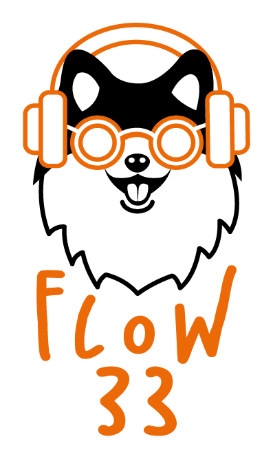
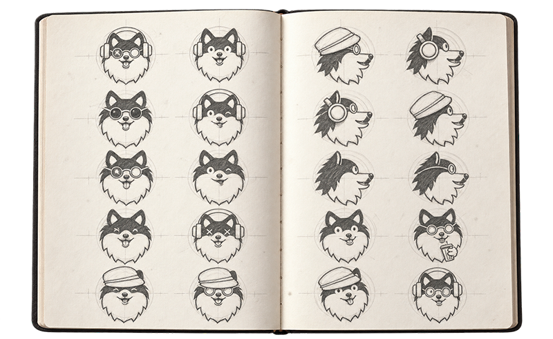
The visual identity combines minimalist retro aesthetics with a playful and approachable personality. At the center of the system is a distinctive Pomeranian character that gives FLOW33 an unexpected and memorable face. Through multiple expressions, poses, accessories, and graphic variations, the character becomes an adaptable visual asset that brings personality to the brand while reinforcing its creative and nostalgic spirit.
03. BRAND ECOSYSTEM
The identity was developed as a complete ecosystem designed to remain consistent across both physical and digital touchpoints. Menus, packaging, signage, merchandise, promotional materials, social media, and digital assets all extend the same visual language. The combination of expressive character illustrations, typography, warm colors, and lifestyle photography transforms FLOW33 from a coffee brand into a recognizable cultural experience built around coffee, music, art, and creative flow.
BRAND STRATEGY
VISUAL IDENTITY
DIGITAL EXPERIENCES
PRODUCT DESIGN
MOTION & CONTENT
INTELIGENT SYSTEMS
Designing stories since 2014
© 2026 SALDIVAR BRAND DESIGN
ALL RIGHTS RESERVED · CDMX, MEXICO