SALDIVAR BRAND DESIGN
CREATIVE STUDIO
Selected work shaped through strategy, identity and digital experience.
© 2026
ALL RIGHTS RESERVED
2014 — 2026
CDMX / MEXICO
PROJECT / 10 / 2020 / CDMX
AMENAZA
MALBEC WINE
DANGEROUS ELEGANCE. A WINE DESIGNED TO DISRUPT.
CASE OF STUDY
ROLE
BRAND STRATEGY
NAMING
VISUAL IDENTITY
PACKAGING
ART DIRECTION
SOCIAL MEDIA
FOCUS
STRATEGY
CONCEPT
IDENTITY
EXPERIENCE
COMMUNICATION
RADICAL SELF-EXPRESSION.
RESEARCH
PROBLEM
AMENAZA NEEDED TO BREAK AWAY FROM CONVENTIONS AND ESTABLISH A MORE DISRUPTIVE POSITION WITHIN THE WINE CATEGORY.
OPPORTUNITY
REDEFINE THE WINE EXPERIENCE THROUGH DANGEROUS ELEGANCE A BRAND LANGUAGE THAT TRANSFORMS THE BOTTLE INTO AN OBJECT OF ANTICIPATION.

00. BRANDING STRATEGY
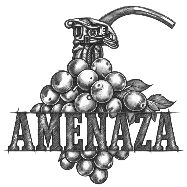
AMENAZA was conceived as a disruption within the traditional wine category. Instead of relying on familiar codes of vineyards, heritage and conventional sophistication, the brand builds its identity around a more provocative idea: Dangerous Elegance. The strategy positions the Malbec as an intense and unexpected experience for an audience that appreciates sophistication but is equally drawn to rebellion, tension and unconventional expression. The bottle becomes more than a container; it becomes the beginning of an experience. Every element of the brand creates anticipation around the moment of opening, transforming the act of uncorking into a metaphorical countdown toward discovery.
01. CONCEPT & VISUAL IDENTITY
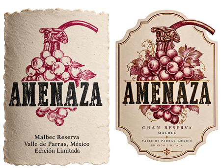
The visual identity translates the idea of danger through an unexpected combination of organic and mechanical language. At the center of the system is a hand-drawn illustration that merges a grape cluster with the mechanism of a grenade detonator, transforming a familiar symbol of wine into an object charged with tension and action. Rustic hatching reinforces the artisanal character of the illustration, while the heavy slab serif typography gives the brand a strong, authoritative presence. A restrained palette built around deep Malbec burgundy creates a visual connection to the wine itself, while the detonator lever becomes the key graphic gesture the small element that transforms tradition into something provocative.
02. PACKAGING & BRAND EXPERIENCE
The identity was translated into a series of tactile applications designed to make the concept tangible. The bottle label becomes the primary stage for the AMENAZA narrative, combining the illustrated grape-and-detonator symbol, textured materials and a bold typographic presence. A specialized hang tag extends the experience beyond the label, introducing an additional physical touchpoint with an artisanal, almost industrial character. Across these applications, the visual language balances rustic craftsmanship with controlled tension, creating a packaging system where texture, illustration and typography work together to communicate the idea of Dangerous Elegance.
03. COMMUNICATION & ART DIRECTION
The brand language was extended into a series of conceptual communication pieces designed to maintain the same sense of anticipation across physical and digital environments. Social media assets and publicity proposals transform the bottle into the protagonist of a high-impact visual narrative, using dark environments, dramatic lighting, grapes, explosive compositions and sensory tension to reinforce the concept. The resulting art direction moves AMENAZA away from conventional wine advertising and toward a more provocative cultural territory one where wine becomes attitude, anticipation and experience. Every touchpoint is designed to make the question inevitable: what happens when you dare to uncork it?
BRAND STRATEGY
VISUAL IDENTITY
DIGITAL EXPERIENCES
PRODUCT DESIGN
MOTION & CONTENT
INTELIGENT SYSTEMS
Designing stories since 2014
© 2026 SALDIVAR BRAND DESIGN
ALL RIGHTS RESERVED · CDMX, MEXICO