SALDIVAR BRAND DESIGN
CREATIVE STUDIO
Selected work shaped through strategy, identity and digital experience.
© 2026
ALL RIGHTS RESERVED
2014 — 2026
CDMX / MEXICO
PROJECT / 07 / 2016 / CDMX
608
NIGHT CLUB
A NIGHTLIFE BRAND BUILT ON NOSTALGIA, RHYTHM, AND RADICAL SELF-EXPRESSION.
CASE OF STUDY
ROLE
BRAND STRATEGY
NAMING
VISUAL IDENTITY
ART DIRECTION
DIGITAL EXPERIENCE
SOCIAL MEDIA
FOCUS
STRATEGY
IDENTITY
EXPERIENCE
CULTURE
WHERE ANALOG RHYTHM MEETS MODERN NIGHTLIFE.
RESEARCH
PROBLEM
NIGHTLIFE BRANDS OFTEN RELY ON FAMILIAR VISUAL CODES, MAKING VENUES FEEL INTERCHANGEABLE. 608 NEEDED A DISTINCTIVE IDENTITY THAT COULD CONNECT WITH A NEW GENERATION WHILE PRESERVING THE CULTURAL ENERGY OF MEXICAN NIGHTLIFE.
OPPORTUNITY
CREATE A BRAND WHERE MEXICAN POP CULTURE, ANALOG MUSIC HERITAGE, AND CONTEMPORARY NIGHTLIFE CONVERGE TURNING NOSTALGIA INTO A DISTINCTIVE, IMMERSIVE VISUAL EXPERIENCE.
00. BRANDING STRATEGY
GENERATIONAL FUSION
608 was conceived around a generational fusion: the nostalgia of 70s and 80s Mexican pop culture meeting the energy of contemporary nightlife.
The strategy was to create a club identity that could feel familiar without becoming nostalgic for nostalgia’s sake. Instead, references from analog music culture, vintage aesthetics and Mexican nightlife were reinterpreted through a contemporary visual language.
At the center of the strategy was the idea of connection through rhythm creating a brand where music, movement, culture and social experience continuously come together.
01. CONCEPT
CIRCULAR RHYTHM
The central concept behind 608 is Circular Rhythm.
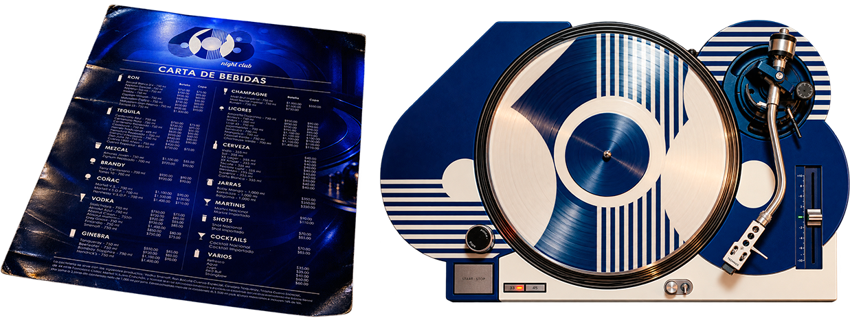
Inspired by the turntable and the continuous movement of a vinyl record, the circle became a metaphor for an experience that never stops. Music turns into movement, movement becomes interaction, and interaction keeps the night in motion.
This idea became the foundation for the identity system, translating the physical geometry of the turntable into a visual language built around circles, repetition, rotation and rhythm.
The result is a concept that connects the analog heritage of music with the perpetual energy of nightlife.
02. VISUAL IDENTITY
GEOMETRY IN MOTION
The visual identity translates the concept of Circular Rhythm into a distinctive graphic system.
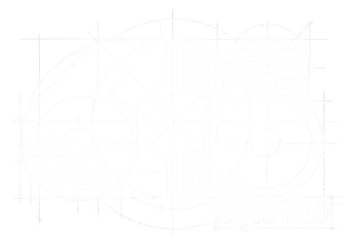
The 608 monogram was constructed through interlocking circular forms, creating a symbol that suggests rotation, movement and continuous interaction. Parallel line patterns reference both vinyl grooves and vintage neon, introducing rhythm and repetition into the identity.
The visual language combines these retro references with bold contemporary typography, creating a balance between Mexican pop nostalgia and modern nightlife culture.
A vibrant blue palette, high-contrast applications and adaptable logo configurations allow the identity to maintain a strong presence across both physical and digital environments.
03. BRAND EXPERIENCE
FROM IDENTITY TO NIGHTLIFE
The identity was designed to exist beyond the logo and become part of the complete 608 experience. The system was applied across VIP access cards, business cards, engraved glassware, menus, promotional materials, digital media, web experiences and illuminated architectural applications, creating a consistent visual presence throughout the club.
The identity was also translated into environmental experiences, from neon-lit facades to branded bar elements and staff uniforms, allowing the graphic language to become part of the atmosphere itself. The result is a nightlife brand where music, architecture, culture and visual identity move as one continuous rhythm.
BRAND STRATEGY
VISUAL IDENTITY
DIGITAL EXPERIENCES
PRODUCT DESIGN
MOTION & CONTENT
INTELIGENT SYSTEMS
Designing stories since 2014
© 2026 SALDIVAR BRAND DESIGN
ALL RIGHTS RESERVED · CDMX, MEXICO