SALDIVAR BRAND DESIGN
CREATIVE STUDIO
Selected work shaped through strategy, identity and digital experience.
© 2026
ALL RIGHTS RESERVED
2014 — 2026
CDMX / MEXICO
PROJECT / 06 / 2019 / CDMX
KOMPSÓ
DESIGNER SCRUBS
A luxury medical apparel brand that bridges clinical performance with high-fashion aesthetics.
CASE OF STUDY
ROLE
BRAND STRATEGY
NAMING
VISUAL IDENTITY
FASHION DESIGN
PRODUCT DESIGN
PHOTOGRAPHY
DIGITAL EXPERIENCE
SOCIAL MEDIA
FOCUS
STRATEGY
IDENTITY
EXPERIENCE
CULTURE
ELEGANCE, REDEFINED FOR MEDICINE.
RESEARCH
PROBLEM
MEDICAL UNIFORMS OFTEN PRIORITIZE FUNCTION OVER PERSONAL STYLE, LEAVING PROFESSIONALS WITH LIMITED OPTIONS THAT BALANCE PERFORMANCE, COMFORT, AND DESIGN.
OPPORTUNITY
CREATE A PREMIUM MEXICAN BRAND THAT REDEFINES MEDICAL WORKWEAR THROUGH THE LANGUAGE OF FASHION, COMBINING TECHNICAL PERFORMANCE WITH ELEGANCE AND PERSONAL EXPRESSION.

01. STRATEGY
FROM UNIFORM TO STATEMENT
The opportunity was to rethink medical workwear beyond its traditional role as a functional uniform. KOMPSÓ was conceived as a premium alternative for healthcare professionals who value design, individuality and performance equally.
The strategy positioned the brand at the intersection of medicine and fashion, creating a new visual and cultural territory for medical apparel. Rather than following the conventions of the category, KOMPSÓ aimed to introduce the codes of contemporary luxury into everyday professional wear.
01. NAMING
ELEGANCE, ROOTED IN MEDICINE
The name KOMPSÓ comes from the Greek concept associated with elegance, refinement and sophistication. The name was selected to establish a direct connection with the historical and cultural roots of Western medicine while giving the brand a distinctly contemporary character.
Its unusual phonetic structure and accent became an opportunity to create a name that feels precise, sophisticated and immediately recognizable bridging the classical origins of medicine with a modern fashion-driven identity.
02. VISUAL IDENTITY
PRECISION MEETS EXPRESSION
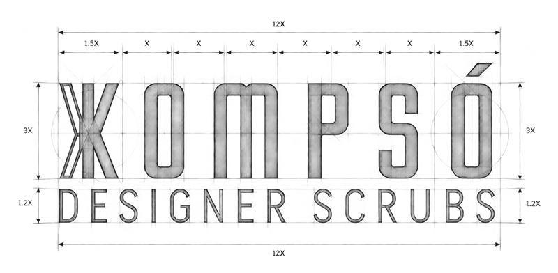
The visual identity translates KOMPSÓ’s positioning into a bold and highly controlled graphic language. A condensed typographic system, strong proportions and a minimal visual vocabulary create a distinctive presence inspired by both fashion labels and clinical precision.
The identity was designed to work across multiple environments from garments and labels to packaging, retail spaces and digital platforms allowing the brand to remain recognizable while adapting to different expressions of the business.
03. BRAND EXPERIENCE
FROM THE GARMENT TO THE ECOSYSTEM
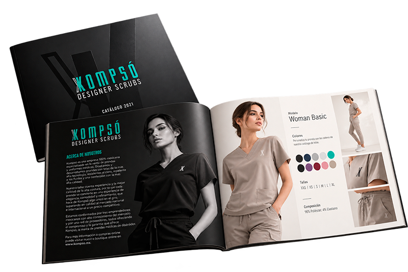
The identity extended beyond the logo to become a complete brand experience. The project included the development of the garments, labels, packaging, photography, catalogs, e-commerce platform and social media presence.
Every touchpoint was designed to reinforce the same idea: medical apparel can perform like technical equipment and communicate like fashion.
The result was a cohesive ecosystem that positioned KOMPSÓ not simply as a scrubs manufacturer, but as a Mexican medical fashion brand with its own visual and cultural language.
BRAND STRATEGY
VISUAL IDENTITY
DIGITAL EXPERIENCES
PRODUCT DESIGN
MOTION & CONTENT
INTELIGENT SYSTEMS
Designing stories since 2014
© 2026 SALDIVAR BRAND DESIGN
ALL RIGHTS RESERVED · CDMX, MEXICO