SALDIVAR BRAND DESIGN
CREATIVE STUDIO
Selected work shaped through strategy, identity and digital experience.
© 2026
ALL RIGHTS RESERVED
2014 — 2026
CDMX / MEXICO
PROJECT / 01 / 2026 / SCOTLAND
AONATY
COMMUNITY THROUGH CONNECTION.
A DIGITAL PLATFORM DESIGNED TO CONNECT PEOPLE WHO NEED HELP WITH PEOPLE WILLING TO OFFER IT.
CASE OF STUDY
ROLE
Product Design
UX Research
Brand Strategy
UI Design
UX Writing
Prototyping
FOCUS
Product Discovery
Product Strategy
Brand Identity
UX/UI
MVP
TECHNOLOGY SHOULD STRENGTHEN HUMAN CONNECTIONS, NOT REPLACE THEM.
RESEARCH
PROBLEM
People often rely on fragmented informal networks to request or offer help.
OPPORTUNITY
Create a simple, trusted platform that makes community support easier to discover and connect.
COMMUNITY THROUGH CONNECTION
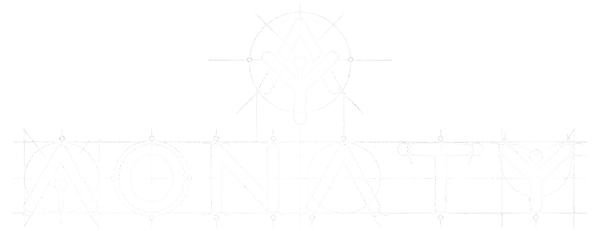
00. Brand strategy & Visual Identity
AONATY was created around the belief that meaningful communities are built through meaningful human connections.
The name draws inspiration from the Scottish Gaelic Aonachd, meaning unity and coming together. The brand combines a caring, inclusive personality with the philosophy:
PATHS CONNECT. PEOPLE UNITE. COMMUNITIES THRIVE.
The Caregiver and Everyman archetypes shape a brand that feels human, trustworthy and approachable, while the visual identity connects people and nature through organic paths, a contemporary color system and a distinctive graphic language.
COMMUNITY THROUGH CONNECTION.

01. Product Discovery & UX Strategy
AONATY addresses a human challenge: meaningful connections with communities are often fragmented across social networks, websites, messaging apps and word of mouth.
The product strategy transformed this challenge into a simple experience centered around:
DISCOVER → CONNECT → PARTICIPATE
The goal was to make community interaction feel natural and accessible, while keeping people and their relationships at the center of the experience.

02. Architecture & User Journey
AONATY brings together people, communities, places and experiences within one connected ecosystem.
The information architecture was designed to make this complexity feel simple, guiding users from discovering a place or experience toward connecting with the people and communities behind it.
The journey turns discovery into interaction, and interaction into participation.
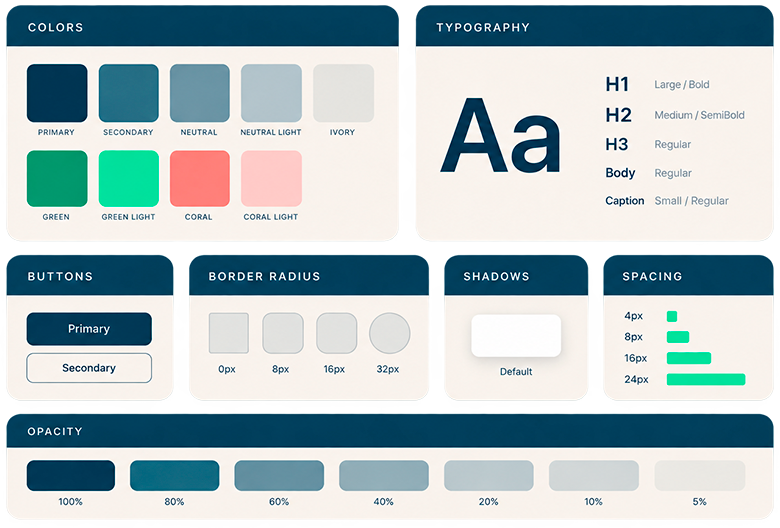
03. Design System & UX Components
The AONATY identity was translated into a modular digital system capable of supporting different types of content, interactions and community experiences.
Typography, color, navigation, experience cards, profiles, forms, tags, notifications and interaction states were structured into reusable components designed to maintain consistency as the product evolves.
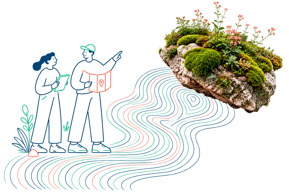
04. Visual Interface & Brand Experience
The interface brings AONATY’s central visual idea to life: nature connects everything.
Organic paths represent the invisible relationships between people, communities and places, while the color system balances technology, nature and human energy through navy, green and coral.
Photography, illustration, typography and interface elements work together to create a digital experience that feels human, contemporary and connected.
05. Hi-Fi Prototype & Product Outcome
The final experience brings together brand strategy, product architecture, UX/UI and design system into a responsive digital product designed across desktop, tablet and mobile.
High-fidelity screens and interactive prototypes transform the original concept into a tangible product experience where people can discover places, connect with communities and participate in shared experiences.
WHEN PEOPLE CONNECT WITH PLACES AND WITH EACH OTHER, COMMUNITIES THRIVE.
BRAND STRATEGY
VISUAL IDENTITY
DIGITAL EXPERIENCES
PRODUCT DESIGN
MOTION & CONTENT
INTELIGENT SYSTEMS
Designing stories since 2014
© 2026 SALDIVAR BRAND DESIGN
ALL RIGHTS RESERVED · CDMX, MEXICO